Thanks for reaching out. We’ll follow up shortly.

FAQs
-
We produce marketing, storytelling and corporate videos.
-
Pricing varies based on project size, complexity, and editing needs. Most projects start around $2,500, and we provide a custom quote to match your goals.
-
Simple projects can be completed in 1–2 weeks, while larger campaigns or multi-video packages may take longer. We’ll provide a timeline upfront so you know what to expect.
-
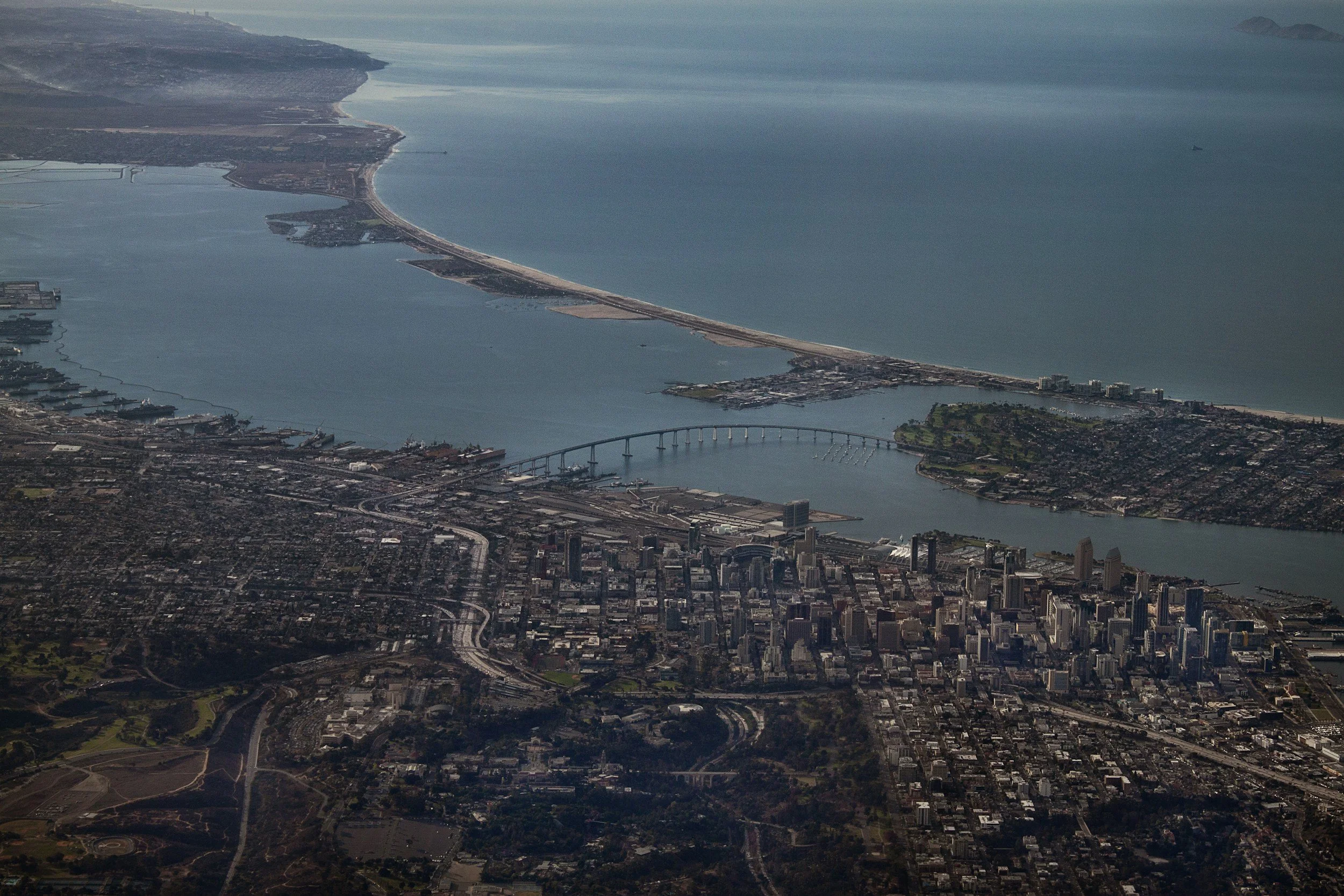
Yes. We film at offices, retail locations, events, and outdoor spaces across San Diego and nearby areas, ensuring your video reflects your real environment.
-
Absolutely. We assist with storyboarding, scripting, interview questions, and visual concepts to make sure your video delivers your message effectively.
-
Yes. We create videos specifically optimized for social platforms, websites, ads, and email campaigns to maximize engagement and conversions.
-
We’re owner-operated, provide personalized service, and combine business insight with creative expertise. Every project is managed efficiently with a focus on your goals and results.
-
Yes. We work on both single projects and multi-video packages, providing a consistent, high-quality production process for ongoing campaigns.
-
Yes. Every video is professionally edited, color graded, and delivered in formats ready for web, social media, and presentation use, including optional captions.
-
Simply fill out the contact form on this page. We’ll review your goals and provide a clear proposal and timeline to get your project moving quickly.